Designing for print is a distinct discipline that requires a different approach than designing for digital screens. While a website can be updated instantly, a printed piece is permanent once it leaves the press.
This finality means that precision and preparation are essential. Understanding the technical requirements of printing services ensures that your vision translates perfectly from the computer screen to the physical page.
Understanding Color Modes

One of the most fundamental differences between digital and print design is the color mode. Screens use light to display color, operating in RGB (Red, Green, Blue). Printers use ink, operating in CMYK (Cyan, Magenta, Yellow, Key/Black).
Designing in RGB and converting to CMYK at the last minute often results in disappointment. Colors that look vibrant and neon on a monitor can appear dull or muddy in print because the CMYK gamut is smaller than RGB. You should always set your design software to CMYK mode before starting a project intended for print.
This allows you to see a more accurate representation of the final output while you work. If you need a specific brand color that CMYK cannot reproduce, you might need to use spot colors, such as Pantone matching, but this typically increases production costs.
Resolution and Bleed
Image quality is non-negotiable in print design. Digital screens often display images at 72 PPI (pixels per inch), which looks fine on a monitor but results in pixelated, blurry images on paper. For high-quality print output, all raster images must be at least 300 PPI at their final size.
Beyond resolution, you must also account for bleed. Bleed refers to the area of artwork that extends beyond the actual dimensions of the document. When a printer cuts a stack of paper, the blade can shift slightly. If your design stops exactly at the edge, this shift might reveal a thin white line of unprinted paper.
Extending your background colors and images 0.125 inches (3mm) beyond the trim line prevents this issue. Always keep critical text and logos within a “safe zone” at least 0.125 inches inside the trim line to ensure nothing gets chopped off.
Selecting the Right Paper

The physical material you choose affects how the design is perceived. Paper weight, texture, and finish play a massive role in the final product.
Coated papers come in glossy, matte, or satin finishes. Glossy paper makes colors pop and text sharp, making it ideal for brochures and flyers. Matte paper reduces glare and offers a more sophisticated, tactile feel, often used for business cards or luxury catalogs.
Uncoated paper absorbs more ink, which can soften images and colors. It provides a classic, natural texture that works well for stationery and letterheads.
You should consult with your printer early in the process to discuss paper stock options. They can provide samples so you can see and feel the difference before committing to a full run.
Typography and Legibility
Text on a screen behaves differently than text on paper. In print, you have absolute control over line breaks and spacing, but you cannot adjust font size for the user. Legibility is paramount.
Avoid using rich black (a mix of all four CMYK inks) for small text. The slight misregistration of plates during printing can make thin letters look fuzzy. Instead, use 100% black (K) for body copy. Be cautious with reverse type, where white text sits on a dark background. If the font is too thin, ink can bleed into the letters and reduce readability.
Ensure that there is enough contrast between the text and the background. What looks readable on a backlit screen might disappear in low-light conditions when printed.
Advanced Finishing Techniques

To make a design stand out, you might consider special finishing techniques. These processes happen after the ink is applied and can add tactile or visual interest.
Foil stamping adds a metallic shine, while embossing creates a raised texture. Spot UV coating applies a clear, glossy layer over specific areas, creating a subtle contrast against a matte background.
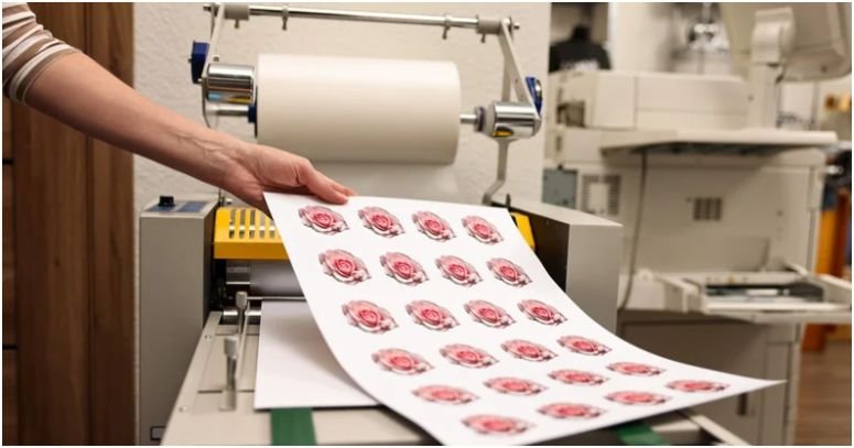
Modern printing technology also allows for rapid drying and processing, which is crucial for high-speed production. Some advanced setups utilize GEW UV curing systems for printing to instantly dry inks and coatings, allowing sheets to be handled or finished immediately without the risk of smudging.
Understanding these capabilities can help you design pieces that utilize complex finishes without extending production timelines significantly.
Proofing and Communication
The final step before mass production is proofing. A soft proof (PDF) is useful for checking layout and typos, but it cannot show accurate color or paper texture. For critical jobs, request a hard proof. This is a physical sample produced on the actual paper stock.
Review the proof meticulously. Check for spelling errors, image resolution, and color accuracy. This is your last chance to catch mistakes. Open communication with your print provider is vital throughout this process.
Ask questions if you are unsure about file formats or specifications. They are experts in their machinery and can offer valuable advice to optimize your design for their equipment.
Conclusion
Designing for print is a blend of creativity and technical discipline. By understanding color modes, resolution, paper selection, and finishing options, you can create materials that look professional and impactful. Avoiding common pitfalls like RGB usage or missing bleed ensures a smooth production process.
Ultimately, a strong partnership with your printing service, built on clear communication and technical preparation, is the key to delivering a flawless physical product.